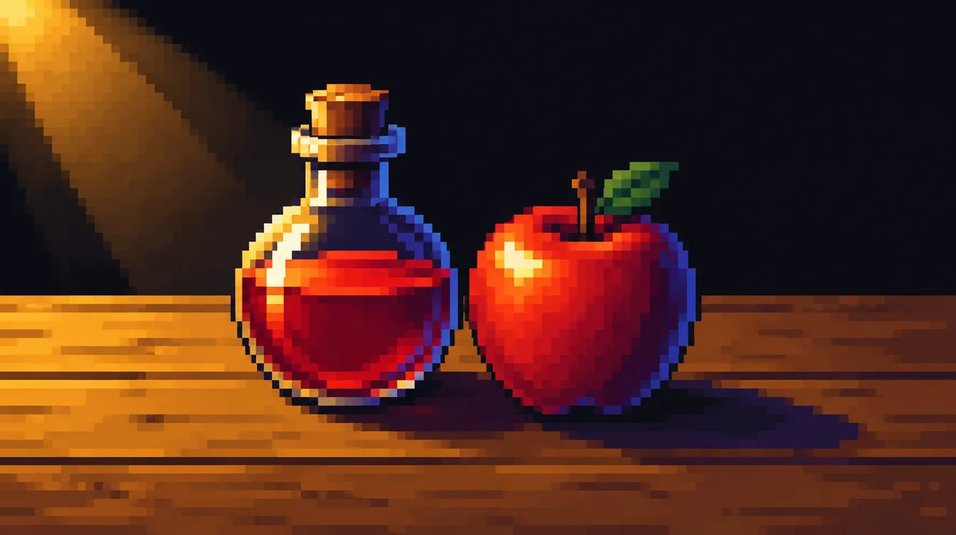
A flat sprite is a shape. A shaded sprite is a thing: a round potion, a heavy helmet, a soft slime. Shading is what turns one into the other—and it’s also where most beginner sprites start to look muddy.
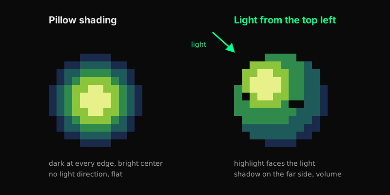
The two balls above use exactly the same five colors. The only difference is where those colors go. On the left, every edge is dark and the middle is bright. On the right, there’s a light source, and the colors follow it. That’s the whole lesson in one picture, and this tutorial takes it apart step by step.
You’ll pick a light source, build a color ramp that shifts in hue instead of just getting darker, shade a simple form, and then learn to recognize pillow shading—the most common shading mistake in pixel art—on your own sprites.
What You’ll Need
- A pixel art editor (I use Aseprite. If you’re new to it, see the Aseprite beginner guide.)
- The basics from Pixel Art Fundamentals—grid, limited palette, outlines
- A sprite size you’ve settled on. If you haven’t, Choosing the Right Resolution and Sprite Size helps
- 45 minutes
Step 1: Pick One Light Source
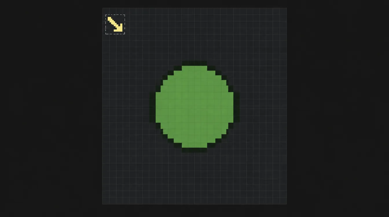
Before you place a single shadow pixel, decide where the light comes from. Every shading decision after this depends on it: which side gets the highlight, which side falls into shadow, where a cast shadow lands.
There’s no single correct direction. Arne, the artist behind the androidarts pixel art tutorial, writes that he prefers a front-side-top light because it “describes form pretty nicely”—and that colored back or rim light has its place when you want to set a mood, for example in a portrait.
For a first sprite, light from above and slightly to one side is a good start: it shows the volume of most shapes clearly and feels natural, because that’s where light usually comes from.
Three practical tips:
- Mark it. Put a small arrow in a corner of your canvas or on a separate layer. It sounds silly, but it keeps you honest when you’re deep in the details.
- One sprite, one light. Don’t let the head be lit from the left and the sword from the right.
- Think about mirroring. If your game flips a character sprite horizontally when it walks the other way, the light flips too. A strong side light makes that flip obvious, while a light from the top and front is far less noticeable.
Step 2: Read the Form Before You Shade
Light only makes sense on a form. So before you think about colors, break your sprite down into simple bodies: a head is roughly a ball, a body a cylinder, a crate a box. The fundamental on Basic Forms covers exactly this.
Pedro Medeiros (Saint11) labels the zones of a lit sphere in his shading tutorial like this:
- Main light: the large area facing the light
- Highlight: the brightest spot, where the surface points most directly at the light
- Terminator: the line where light turns into shadow
- Bounce light: a little light reflected back into the shadow from the surroundings
- Shadows: a projected shadow on the ground with a hard edge, and a self-cast shadow on the object with a soft edge
You don’t need all of these on a 16-pixel sprite. But knowing them helps you decide which ones are worth the pixels. On small sprites, main light, shadow and a tiny highlight are often enough.
Different surfaces catch light differently. A ball has a soft, gradual terminator. A box has flat faces, and each face is mostly one solid color—Saint11’s tutorial makes the same point. Get that wrong and a box starts to look like a pillow.
Step 3: Build a Hue-Shifted Color Ramp
A color ramp is a row of colors from dark to light that you use to shade one material: three to five steps are plenty for most sprites. How you build that ramp decides whether your shading looks alive or muddy.
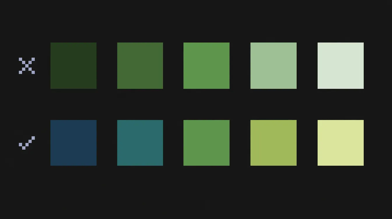
The obvious approach is to take your base color and mix it with black for the shadows and with white for the light. Arne advises against exactly that: “In nature, the hue of a color often changes as it goes from light to dark, so a black-pink-white ramp can look muddy and artificial.” Saint11 says the same in his own words: when you shade, change not only the brightness but also the hue.
So instead of just going darker or lighter, you shift the hue along the ramp. Arne gives two concrete examples:
- Skin: a grayish warm purple in the shadow, an orange mid-tone, an almost yellowish light.
- Outdoor scenes: colder grayish tones in the shadows, because of the sky, and yellow in the lights, because of the warm sunlight.
A practical way to build a ramp:
- Pick the base color—the mid-tone your viewer will see most.
- Shadow steps: make each step darker and nudge the hue a little toward a cooler color (for an outdoor scene) or toward purple (for skin). Lower the saturation slightly as you go.
- Light steps: make each step lighter and nudge the hue toward a warmer color, usually yellow.
- Check the steps. Each color should be clearly distinguishable from its neighbors. If two look almost the same, merge them.
One warning from Arne: avoid building long ramps out of fully saturated colors. They get loud fast.
If you’d rather start from a tested palette, the Lospec palette list lets you filter by the number of colors. Pick a small one, sort its colors from dark to light, and look at how the hue changes from step to step—a quick way to learn how other artists shift their hues. For the theory behind hue, saturation and value, see Color Theory for Games.
Step 4: Shade a Simple Form
Now put it together on a simple object, such as a ball, an apple or a potion bottle. Work in this order:
- Flat fill. Fill the whole silhouette with your base color. No shading yet. Check the silhouette—if it doesn’t read flat, shading won’t save it.
- Shadow shape. With your light arrow in view, paint the shadow side in the next darker color. Think of it as a shape with a clear edge, not a soft cloud. The edge is your terminator.
- Deepest shadow. Add the darkest color only where the form turns furthest away from the light, plus the cast shadow on the ground if your sprite has one.
- Highlight. Add the lightest color sparingly, on the spot facing the light. One small cluster usually beats a long stripe.
- Optional bounce light. If your sprite is big enough, a slightly lighter edge inside the shadow, opposite the light, can add volume. On small sprites, skip it—it often reads as noise.
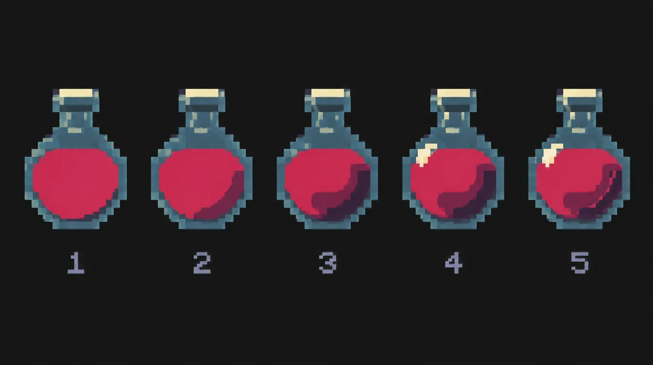
Zoom out to 100% after each step. Shading that looks great at 800% can turn into mush at real size.
Step 5: Spot Pillow Shading
Now the most important check. Arne describes pillow shading like this: it “can look a bit like a pillow, with a soft radial gradient ramping up towards the center of the form.” It can make the form look uninteresting or irrelevant to the shape of the object.
That’s exactly the left ball in the image at the top. Every edge is dark, the middle is bright, and nothing tells you where the light is. Each color follows the outline of the shape, not the light.
Why does this happen? Because it feels logical: edges are “where the shape ends,” so they get dark. But light doesn’t care about outlines. A ball lit from the top left has a bright top left edge.
The test: cover your light arrow and look at your sprite. Can you tell where the light comes from? If the brightest spot sits in the middle and the darkness wraps all the way around, you’re pillow shading.
The fix: Arne’s advice is to make the gradient sculpt something interesting—to make it describe the form. In practice:
- Go back to your light arrow.
- Brighten the edges that face the light. They can touch the outline in your mid-tone or even your light color.
- Push the darkest colors to the side facing away from the light.
- Move the highlight off-center, toward the light.
Arne also notes that flat-looking rim light or rim shadow can be a variant of pillow shading. A thin bright line around the whole shape doesn’t fix the problem—it just hides it.
Step 6: Clean Up Bands and Outlines
With the light in place, two details decide how polished the result looks.
Banding. Arne describes banding as visible bands of color that draw attention to the borders between color fields. You’ll often see it when color steps run parallel to each other at the same width, so the eye reads stripes instead of a form. Saint11 suggests compressing color bands so the steps are harder to see. Break up the bands: vary their width, let one color reach further into its neighbor at some points.
Dithering. Checkerboard patterns can blend two colors. Arne uses dithering sparingly and finds it most effective when it does double duty—creating a gradient and showing a texture. On a smooth ball, plain color areas usually look cleaner.
Outlines. A black outline all around fights your lighting: it makes the lit edge as dark as the shadow edge. Saint11 suggests using a dark color instead of black, removing the outline in lighter areas and using it to reinforce the shading—he calls it selective outlining. The outline styles themselves are covered in the fundamentals.
Fewer colors. If you’re tempted to add more in-between colors to smooth a gradient, remember Arne’s warning: that “can be a trap because pixel art actually often looks better with a restrained palette.”
Common Mistakes
Pillow shading. Dark edges all around, bright center, no light direction. Fix it by brightening the edges that face the light and moving the highlight toward it.
Mixing in black and white. Ramps that only get darker or lighter look gray and flat. Shift the hue: cooler or more purple in the shadows, warmer in the lights.
Two light sources by accident. The head lit from the left, the shield from the right. Mark your light direction and check every part against it.
Too many colors. Five shades of one green with barely visible differences don’t make a smoother sprite, they make a blurrier one. Merge steps that look alike.
Highlights everywhere. If everything shines, nothing does. One highlight per form, on the side facing the light.
Black outlines on the lit side. They cancel out your light. Use a dark color from your ramp and lighten or drop the outline where the light hits.
Shading before the silhouette works. Shading adds volume, not readability. If the flat silhouette doesn’t read, fix that first.
Quick Reference
- One light source per sprite—mark it with an arrow
- Ramp: 3–5 colors, hue shifted along the way, no pure black or white at the ends
- Order: flat fill → shadow shape → deepest shadow → highlight → optional bounce light
- Pillow test: cover the arrow—can you still tell where the light comes from?
- Clean-up: break bands, use dithering sparingly, selective outlines
What You’ve Learned
- Why one consistent light source comes before any shading
- How to read a form as simple bodies and where light and shadow fall on them
- How to build a hue-shifted color ramp instead of mixing in black and white
- How to recognize pillow shading and fix it
- How banding, dithering and outlines affect the final look
Next up: take the sprite you drew in the Pixel Art Fundamentals, give it one light source and a hue-shifted ramp, and run the pillow test. And if your colors still feel off, Color Theory for Games is the next stop.
Sources
- Arne (androidarts): Pixel Art Tutorial (accessed November 2026)
- Pedro Medeiros (Saint11): Pixel Art Tutorials, especially “Shading”, “Illumination Techniques” and “Outlines” (accessed November 2026)
- Lospec: Palette List (accessed November 2026)