Color isn’t decoration—it’s communication. In games, color tells players what’s dangerous, what’s safe, what’s important, and what’s background noise. The wrong palette creates confusion; the right one makes gameplay intuitive.
Beyond function, color creates emotional atmosphere. The eerie greens of a poison swamp, the warm oranges of a cozy inn, the stark red of a boss arena—these palettes prime players’ emotions before a single enemy appears.
What You’ll Need
- Any digital art software with color picker
- Access to a color wheel tool (Adobe Color, Coolors, etc.)
- 45 minutes for theory and practice exercises
Step 1: Understand the Color Wheel
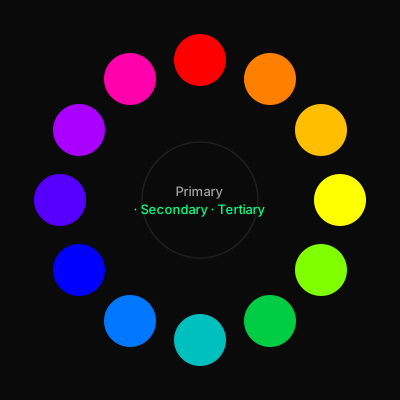
The color wheel is your roadmap. It organizes colors by their relationships, making it easy to create harmonious palettes systematically rather than by guesswork.
Primary colors (red, yellow, blue) can’t be created by mixing. Secondary colors (orange, green, purple) come from mixing two primaries. Tertiary colors fill the gaps between.
Memorize the wheel’s structure. When you know that orange sits between red and yellow, you can predict that a red-orange will bridge those hues. This knowledge lets you adjust colors confidently without trial and error.
Step 2: Master Color Properties
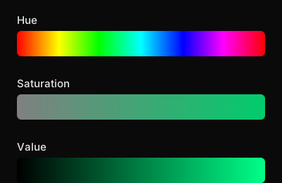
Every color has three properties you can manipulate:
Hue
The color’s position on the wheel—red, blue, green, etc. This is what we typically mean when we say “color.”
Saturation
The intensity or purity of the color. High saturation = vivid. Low saturation = muted, grayish. Desaturated colors feel more realistic and mature; saturated colors feel energetic and stylized.
Value
The lightness or darkness. This is the most important property for readability. Strong value contrast makes elements pop; weak contrast makes them recede. Many artists test their work in grayscale to verify value structure.
Step 3: Apply Color Harmonies
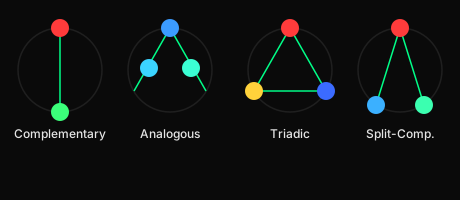
Color harmonies are proven combinations that work together. Here are the essential ones for game art:
Complementary
Colors opposite on the wheel (red/green, blue/orange). High contrast and energy. Use for emphasis—a red health bar on a green environment pops instantly.
Analogous
3-5 colors adjacent on the wheel (blue, blue-green, green). Harmonious and calming. Perfect for cohesive environments. Most of your scene should use analogous colors.
Triadic
Three colors equally spaced (red, yellow, blue). Vibrant and balanced. Common in stylized games with distinct factions or zones.
Split-complementary
A color plus the two colors adjacent to its complement. Less tension than pure complementary, but still dynamic.
Step 4: Create Mood with Color Temperature
Colors divide into warm (red, orange, yellow) and cool (blue, green, purple). This simple division drives emotional response in game art.
Warm colors advance—they feel closer and more energetic. Use them for threats, important items, and player characters. A warm-colored enemy reads as immediate danger.
Cool colors recede—they feel distant and calm. Use them for backgrounds, safe zones, and atmospheric depth. A blue-tinted forest feels mysterious and vast.
Temperature contrast creates focal points. In a cool environment, a single warm element (a torch, a character, an item) becomes an instant beacon for the player’s attention.
Step 5: Build Game-Ready Palettes
For game art, palettes need structure. Here’s a practical framework:
Dominant Colors (60-70%)
Start with 2-3 dominant colors. These set the overall mood. Keep them within one temperature range for cohesion.
Accent Colors (20-30%)
Add 1-2 accent colors. These should contrast with your dominants—often the complement or a saturated version. Use these for interactive elements, enemies, and collectibles.
Signal Color (5-10%)
Reserve 1 signal color. This ultra-high contrast color marks critical elements: danger, health, objectives. Red often works, but any saturated warm color can serve.
Test your palette: can you identify player, enemies, collectibles, and environment at a glance? If not, increase contrast between functional categories.
Step 6: Apply Color in Practice
Let’s put theory into practice with a platformer level:
| Element | Color Strategy | Example |
|---|---|---|
| Environment base | Analogous cool colors | Deep blue, teal, dark green |
| Platforms/terrain | Slightly warmer versions | Blue-gray, muted teal |
| Player character | Warm accent | Orange, yellow |
| Enemies | Different warm accent | Red, magenta |
| Collectibles | Bright, saturated | Gold, bright green |
This hierarchy ensures every element is readable at game speed, even in complex scenes.
What You’ve Learned
- The color wheel structure and how to use it
- Manipulating hue, saturation, and value
- Applying proven color harmonies
- Using temperature for mood and focal points
- Building structured, game-ready palettes
Color theory is a skill that improves with practice. Start analyzing every game you play: what colors define the player? How do enemies stand out? What makes safe zones feel safe? This awareness will transform your palette decisions.